Streets to Stability
“This is the maze that unhoused people seeking care in San Francisco must navigate. Let’s untangle homelessness.”


Background
Our team partnered with Crankstart, a San Francisco-based nonprofit, to bring their homelessness policy report to life on the web. The report exposes a system of service providers that is notoriously difficult for unhoused individuals to navigate and a 12-step plan to overhaul and improve said system.
Our role was to distill this report into an engaging, human-centered digital experience, using data visualization to convey just how overwhelming the existing system is for the people who need it most.
How Might We Questions
How might we drive home the complexity of the support system that unhoused San Franciscans must navigate?
How might we craft an engaging, accessible summary of the report's findings and recommendations?
How might we present the report's 12-step plan in a way that resonates with both the general public and policymakers?
How might we humanize the data?
Team dynamics
I was Design Lead on this effort, working with a cross-functional team to translate the dataset into compelling storytelling and visualizations. We collaborated closely with Crankstart's leadership and the report's authors throughout the process.
Tools
Figma
Flourish
Observable (JavaScript, d3)
My Role
UX/Content strategy
UX/UI design
Data visualization design
Prototyping
Dev handoff
Impact
The Streets to Stability website launched in 2024. Following Daniel Lurie's election as mayor in November 2024, the plan's recommendations were fully adopted. Kunal Modi, the primary author of the report, was appointed San Francisco’s Chief of Health, Homelessness, and Family Services and now leads its implementation.
San Francisco's 2026 PIT Count showed the city moving in the right direction: homelessness down 4% overall, unsheltered numbers declining, and the highest sheltered rate recorded to date.
AWARDS
Information Is Beautiful Awards, 2024 Longlist
Kick off
Before we could get to visualizing, we needed to understand the data. The report was written with policymakers as its primary audience, but the website needed to speak to the general public, too. That meant distilling complex findings and policy recommendations into a narrative that was clear and accessible without losing its substance.
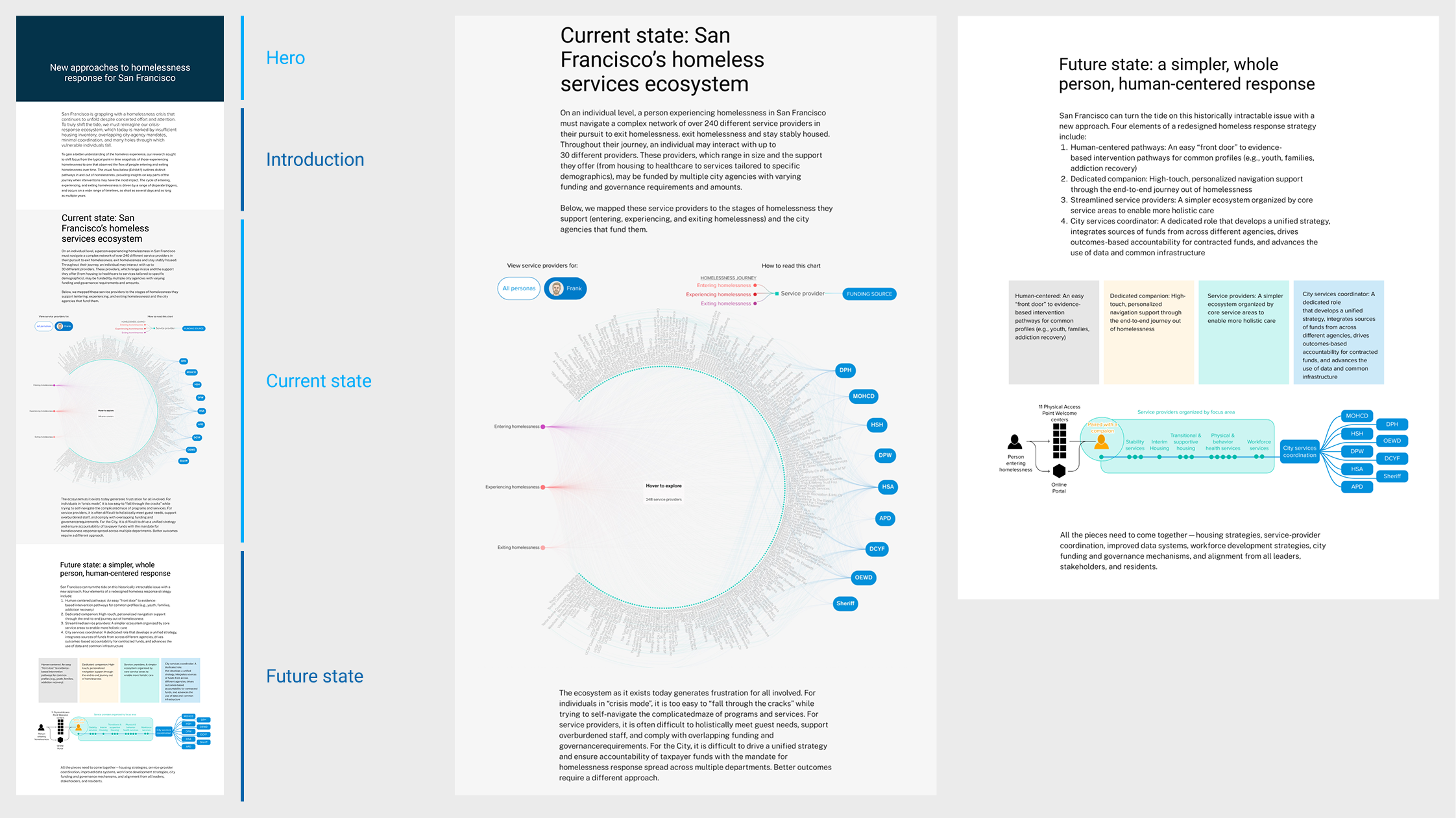
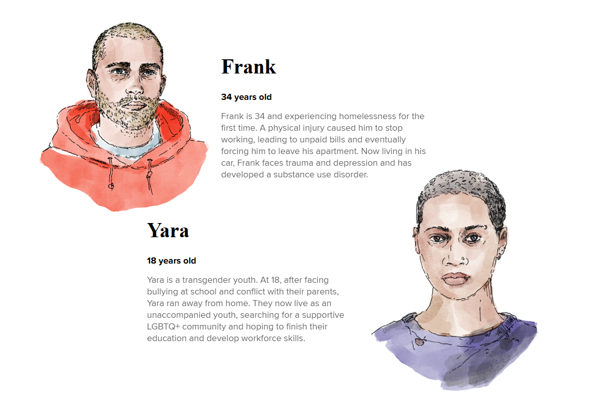
Key takeaways: The current state of homelessness in San Francisco
Unhoused San Franciscans are demographically diverse, each with a unique lived experience, yet all of them must navigate the same fragmented system to get help
San Francisco's homelessness response is built around departments and service providers, not the people it's meant to serve
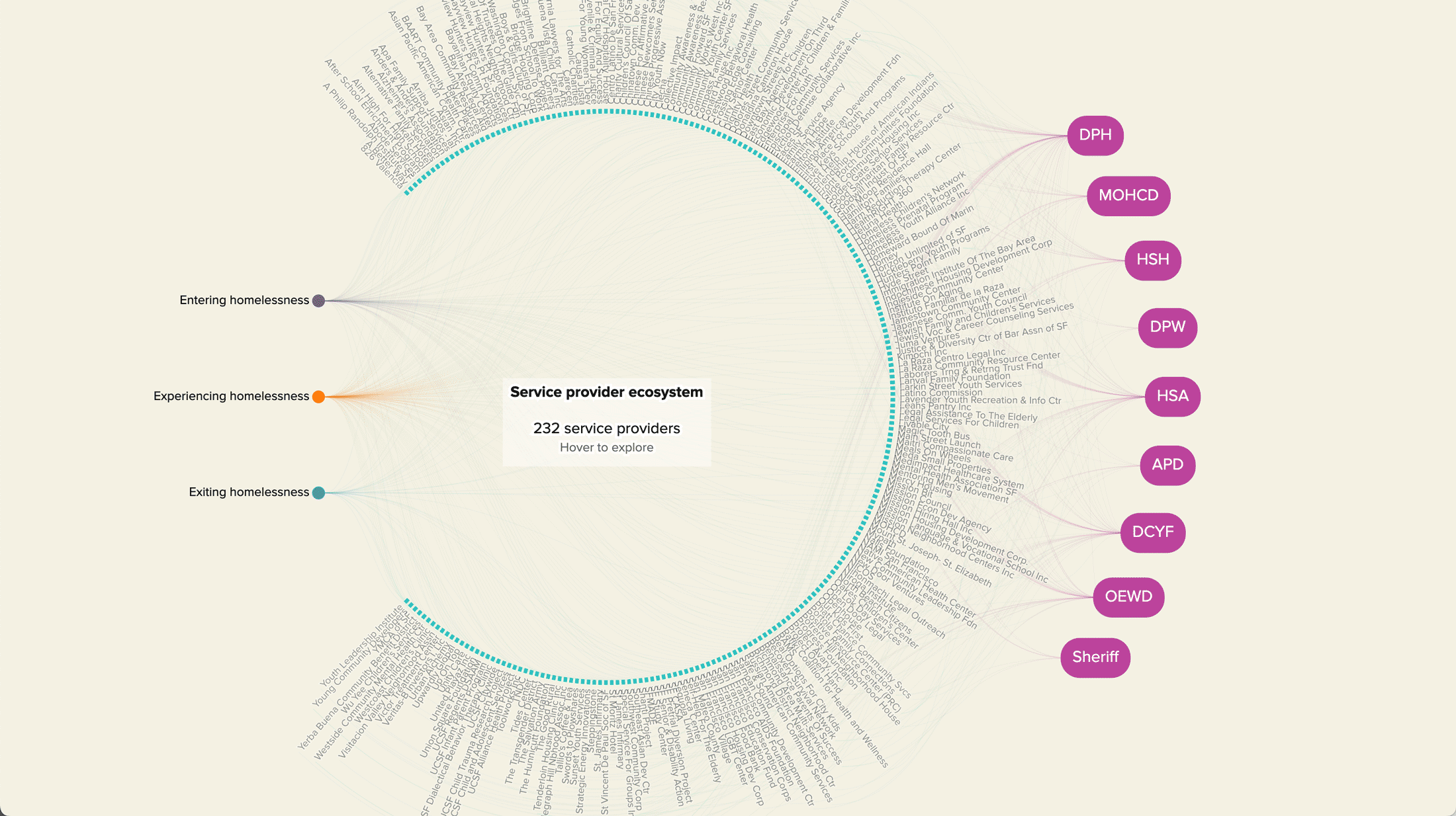
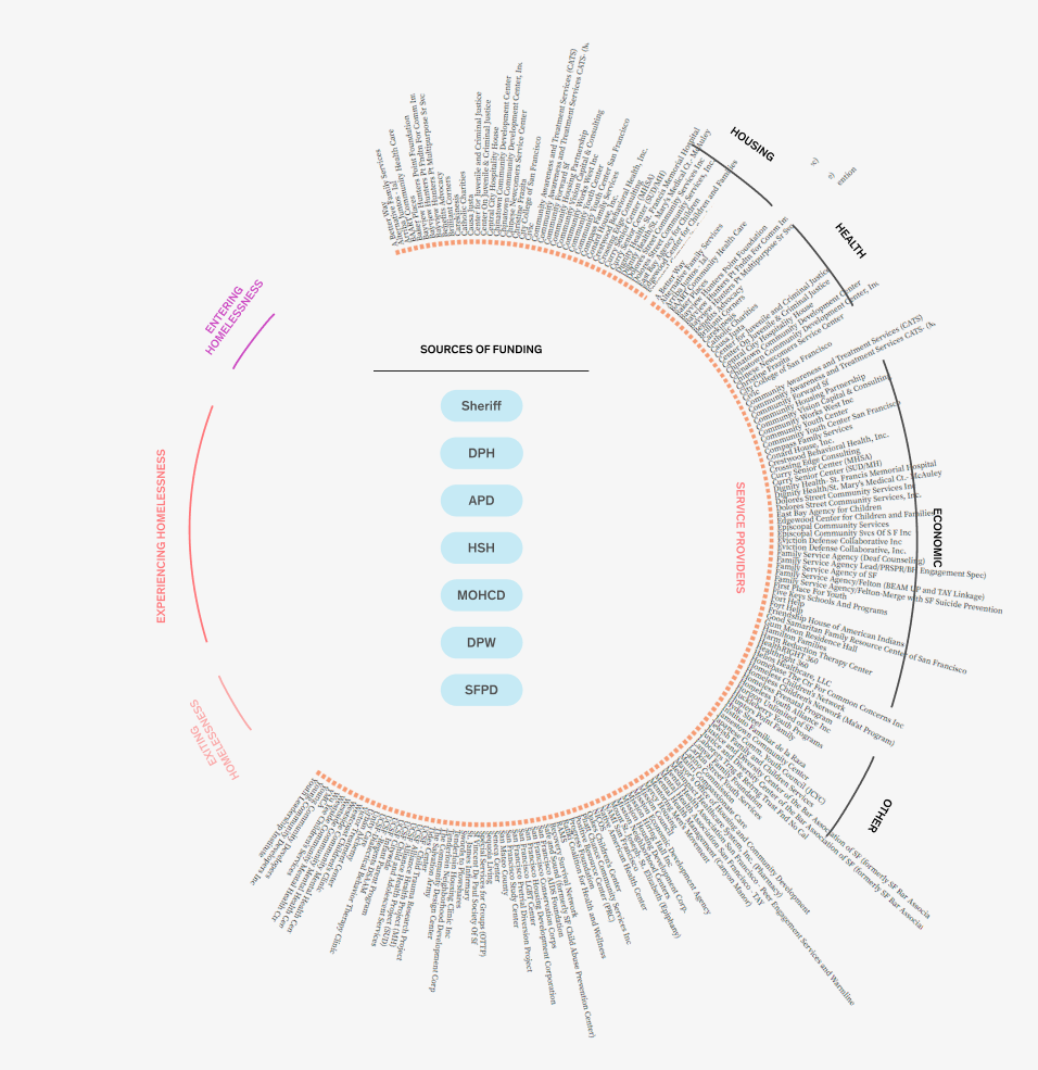
The system spans 232 service providers across nine city agencies, funded by billions of public dollars
These services often overlap — an unhoused individual may need to navigate as many as 30 service providers just to get the help they need.
We aligned on a four-part narrative structure that would guide the information architecture:
Landing page: set the stage and introduce the problem
Context: provide background and scale
The problem: illustrate the current state of the system
The solution: show what a better future could look like
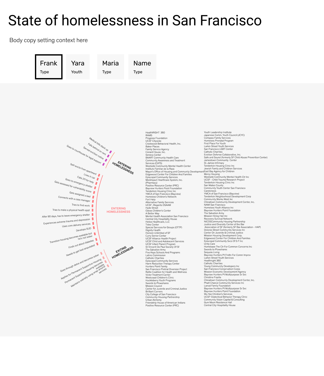
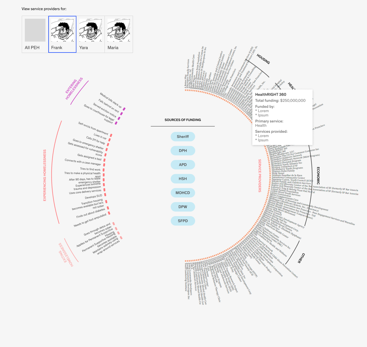
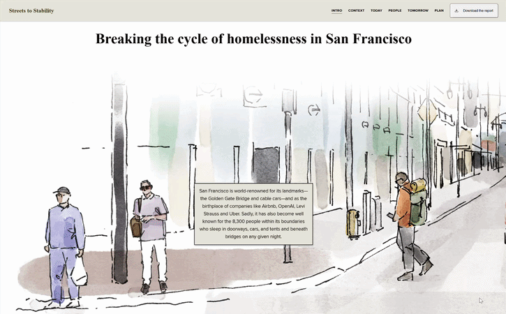
Taking a persona-based approach
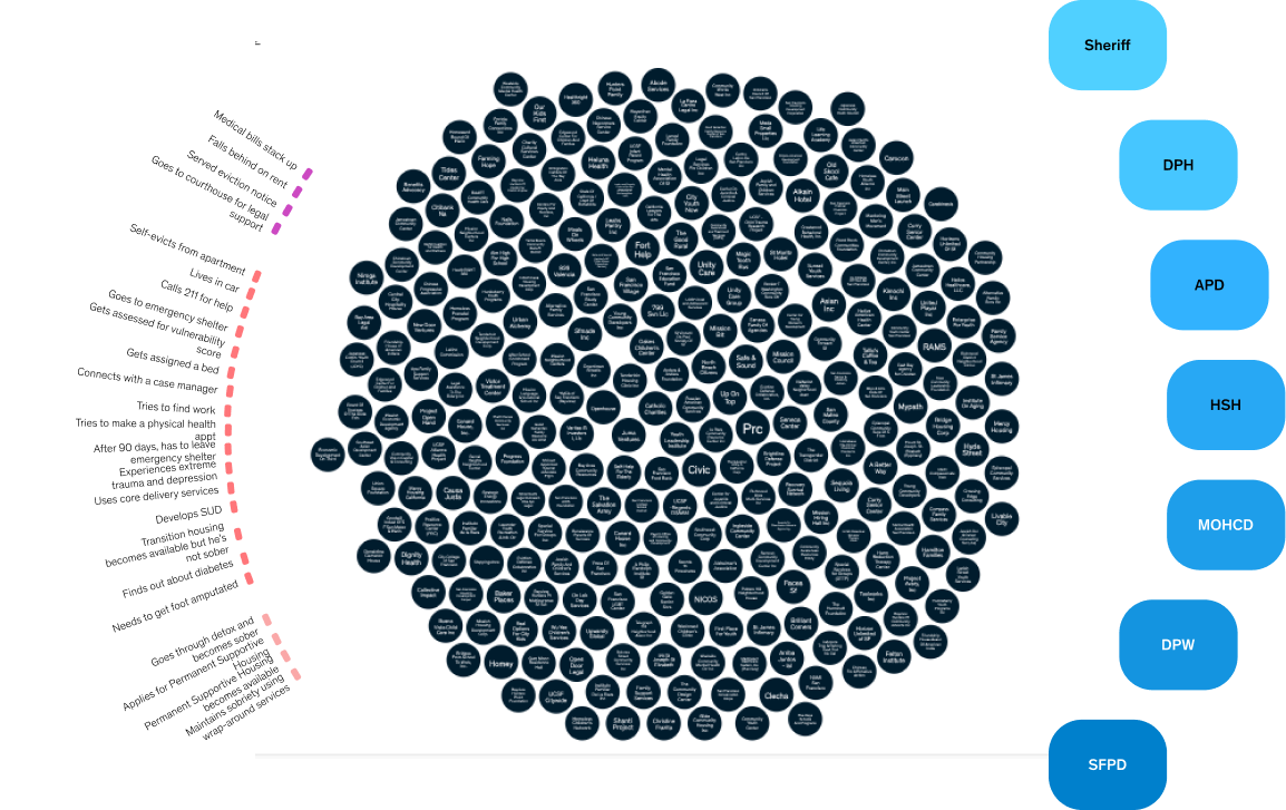
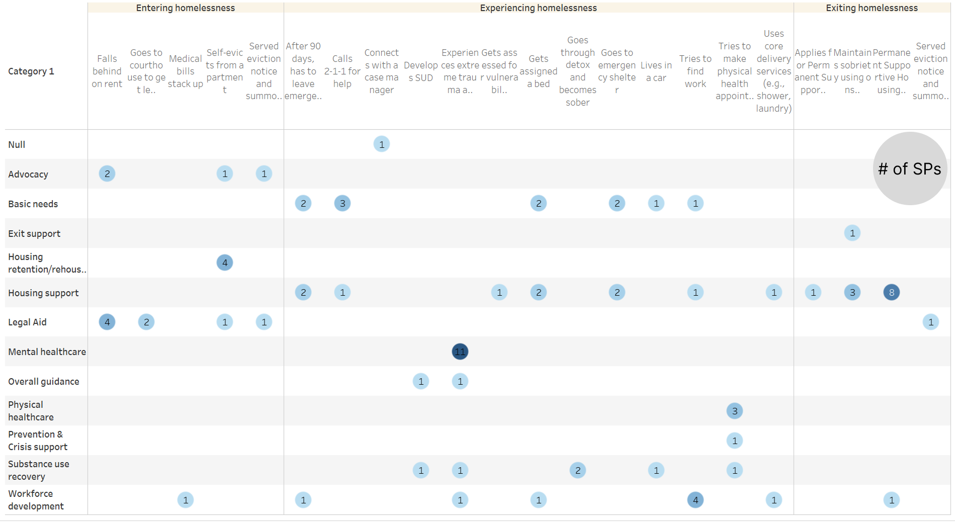
Mapping the full web of service providers illustrates the scale of the problem, but to truly humanize the data, we also wanted to show what navigating that system actually looks like for a real person.
While the report introduced multiple “faces of homelessness,” we narrowed our focus to two personas, Frank and Yara, to visualize their individual journeys through the system. This served three goals:
Humanize the data: Put a human face on the statistics
Show that no two journeys are the same: A first-time unhoused person recovering from an injury has vastly different needs than someone experiencing recurring homelessness due to addiction
Demonstrate that the system is overwhelming no matter what: Even when filtered down to a single persona's journey, the complexity doesn't go away
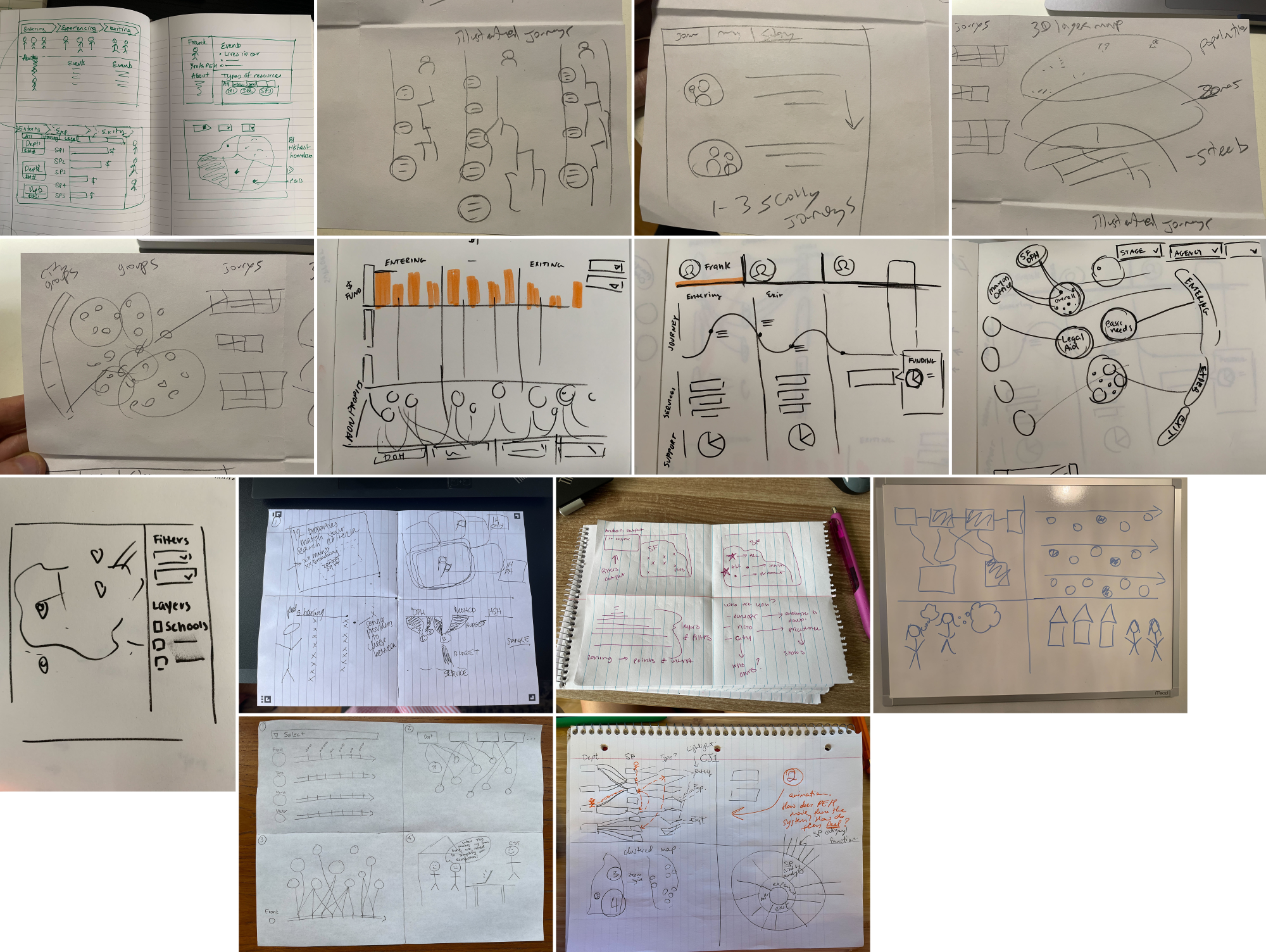
Ideation
Before diving into execution, we ran a lightning sketching session: one minute per sketch from every person in the room. This put a wide range of ideas on the table on Day 1, and got the team excited about potential ways to visualize the data.
Unhoused San Franciscans may need to navigate up to 30 service providers just to get the help they need. To illustrate how overwhelming the existing system is, we mapped each stage of the homelessness journey to its relevant service providers, and each provider to the agencies that fund them.
To find the right visualization approach, I explored design concepts in Figma and Flourish while our data scientist experimented in Tableau and our developer in D3. As we narrowed in on a direction, I iterated on the D3 outputs (exported to svg) directly in Figma.
Wireframes
We initially planned for a toggle between the 'all providers' view and individual personas. This would allow readers to quickly shift from the entire system to a specific journey to demonstrate the complexity when filtering down to an individual’s needs.
One of my early drafts housed the “overall” and persona-specific diagrams in the same viz, with a toggle to flip between the different versions.
However, as the design evolved, we felt that introducing both concepts at once was too much for audiences to take in on a single page.
This decision was part of a larger structural evolution. What started as a long-scroll one-pager grew into a more comprehensive, multi-section website:
Landing page: Draw audiences in and introduce the problem
Context: Background and framing
Today: The current state of the system, illustrating the full complexity of the provider landscape
People: Introduce the faces of homelessness, with a deep dive into two personas and the provider chart in that context
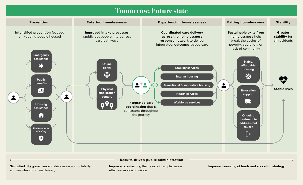
Tomorrow: What the future could look like
Plan: Twelve steps to make homelessness in San Francisco rare, brief, and non-recurring
Development
Development kicked off in parallel with design. Our developer, Kelsey Nanan, started on the data visualizations first — a no-regrets move while the page architecture was still taking shape. She built in D3, I'd pull the SVGs into Figma, and we'd iterate from there, experimenting with colors, interactions, and layout using the real data. Working with actual outputs rather than placeholder charts meant our design decisions were grounded from the start.
Visual design
Most coverage of homelessness utilizes dark, heavy visuals. Our stakeholders wanted to go in a different direction: something that felt serious and credible, but also warm and accessible enough to engage a general public audience. Because the site introduces a plan to improve the system and the lives of people navigating it, the design needed to reflect that — the future state should feel hopeful, not hopeless.
To that end, we landed on a clean, editorial aesthetic with an open layout and a warm, restrained color palette.
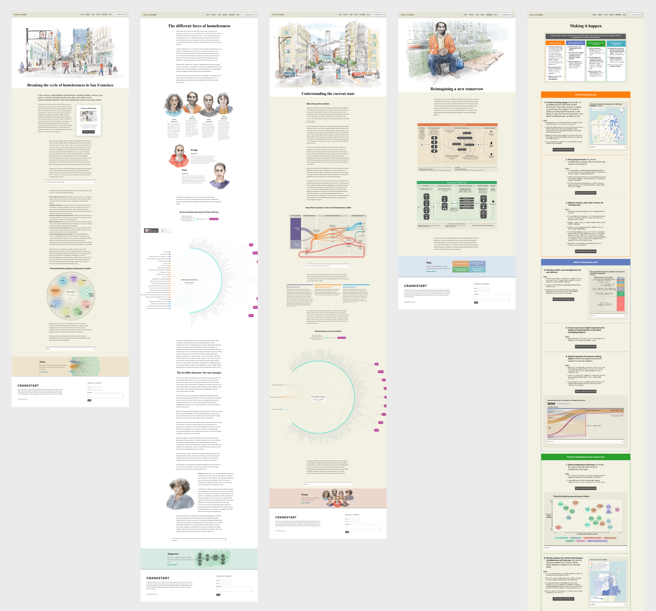
Introduction
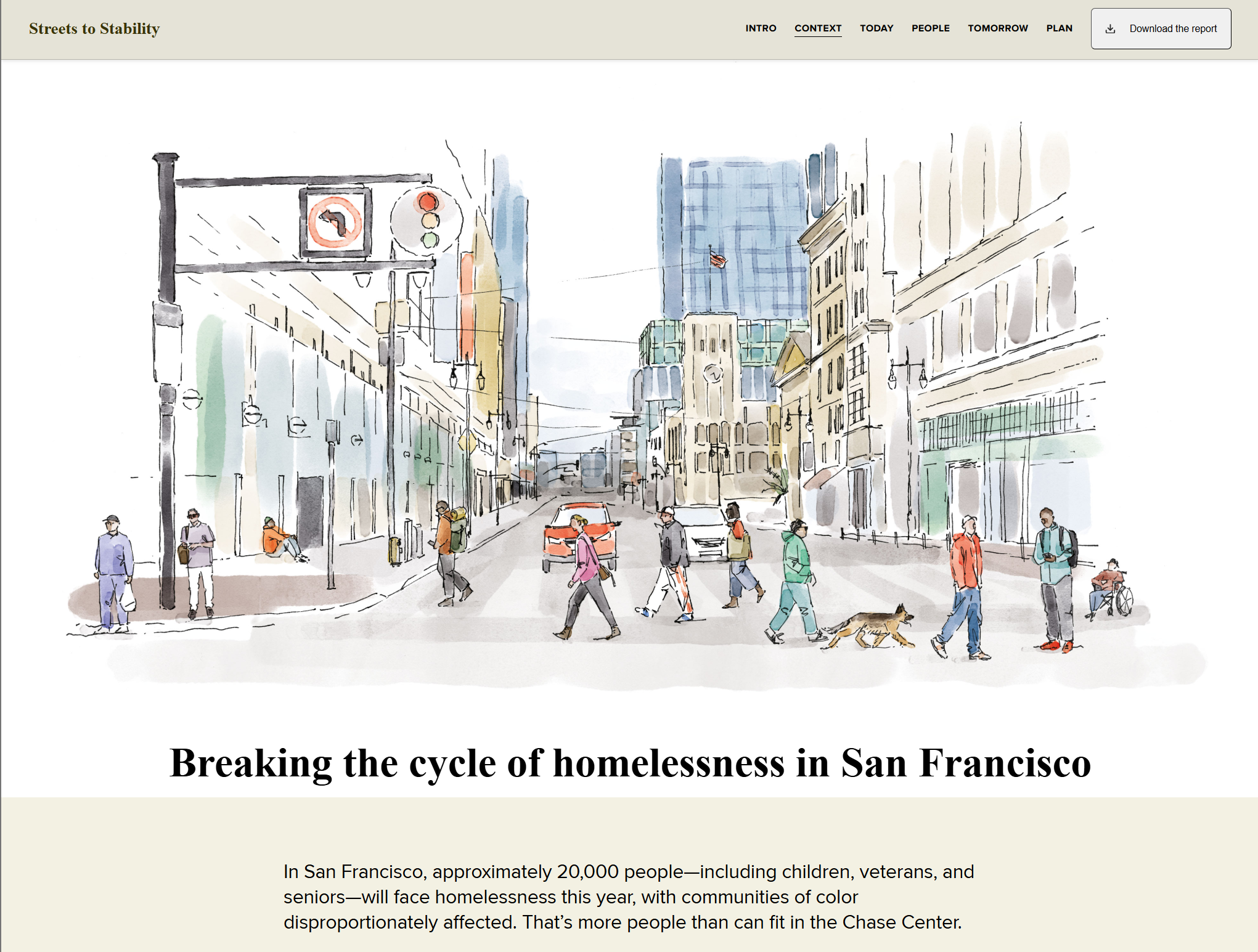
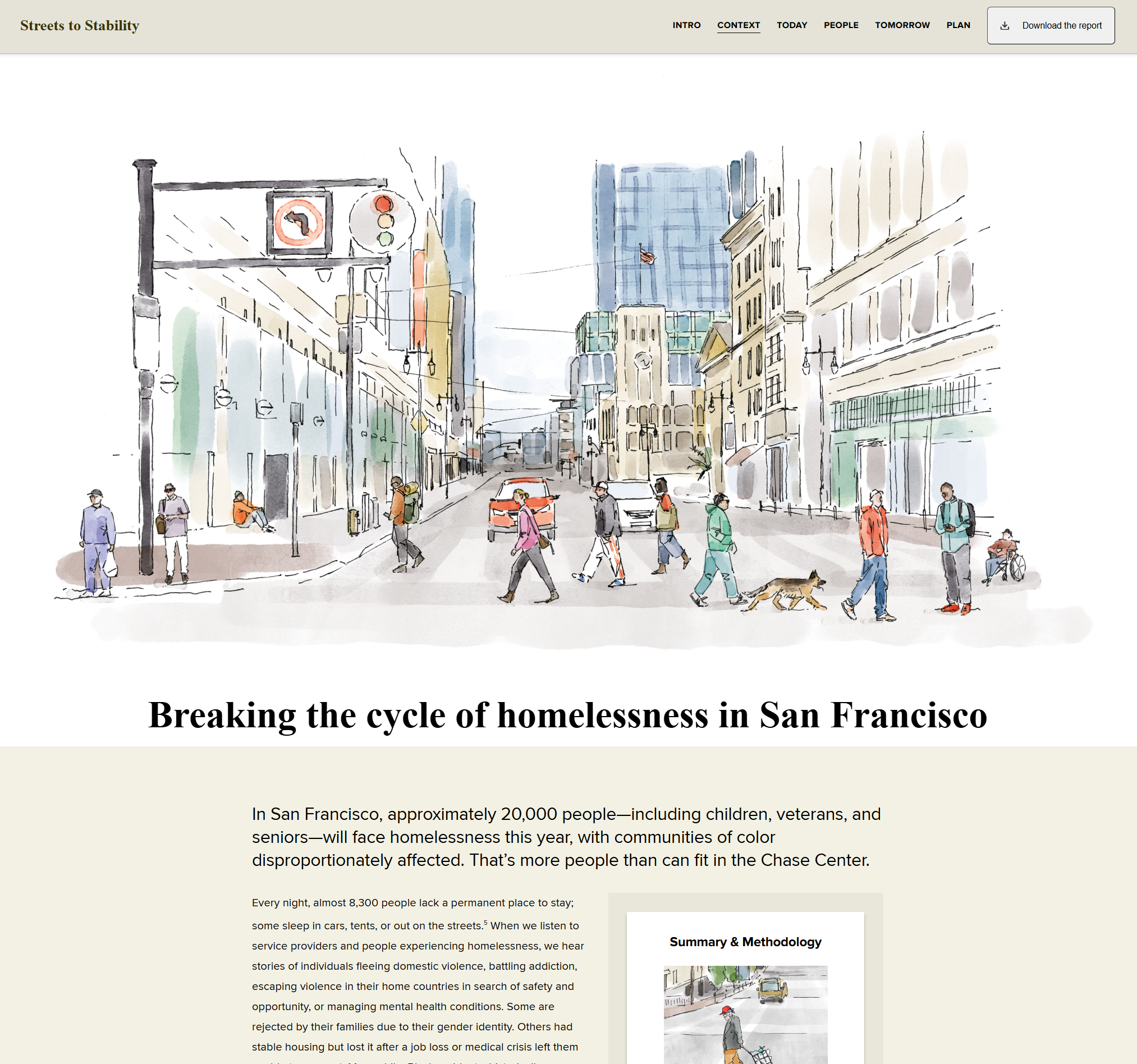
As the site grew into a more comprehensive experience with a lot to communicate, we needed a hook. The solution was a two-part opening: a splash page leading with the ecosystem diagram — our star visualization — to immediately confront the reader with the scale of the problem, followed by an intro page that eases them in through scrollytelling over a painting of the streets of San Francisco.
Setting the stage through scrollytelling
We made the deliberate choice to commission digital paintings rather than use photography of unhoused individuals. The illustrations gave us full creative control over tone and representation while still adding warmth and a human quality.
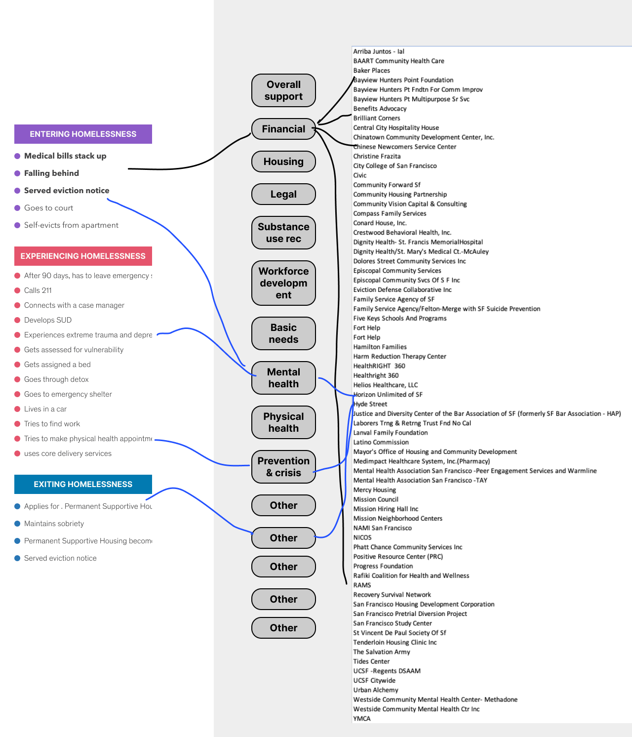
Additional visualizations
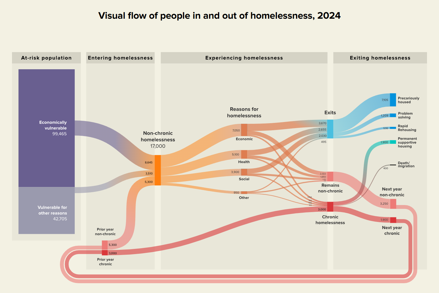
Flowing in and out of homelessness

Current vs future state journey
To contrast the current and future states of the homelessness journey, I created two journey maps: one highlighting the pain points and barriers that exist today, and a more streamlined version depicting a better-coordinated system of the future.
Reflection
This project is one I’m quite proud of — our work played a role in moving the needle on something consequential. The visualizations we built were used in talks advocating for the plan's adoption, and the 12-step recommendations are now being implemented across California.
A big part of what made the dataviz successful was the close collaboration with our developer from the get-go. The back-and-forth between her D3 builds and my Figma explorations meant we were constantly pushing the work forward together, and I think the final visualizations reflect that.
The tight timeline didn't leave much room for user testing, which is the one thing I'd do differently given more time. Much of our feedback came from stakeholders and subject matter experts who brought a depth of knowledge that most visitors won't have. Earlier testing with a broader audience could have surfaced opportunities to simplify even further.
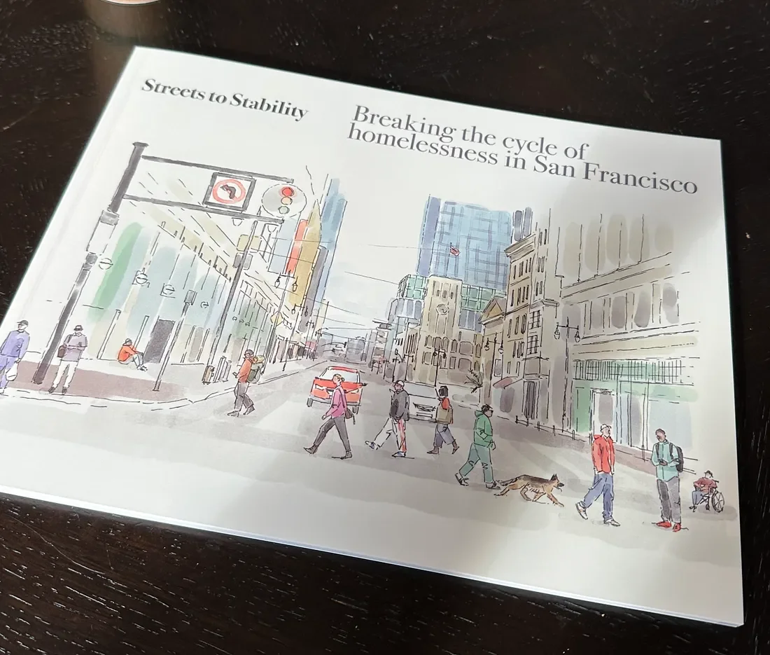
Our work was adapted into a booklet and distributed at the program launch. Image via Tom Poster, Medium